|
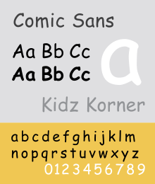
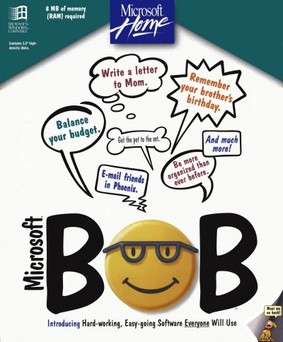
Apparently my post of a couple of days ago regarding fonts struck a nerve, judging by the comments and emails. Just what is it about Comic Sans that drives people to such passionate heights of love and hate? Personally, I have nothing against the Comic Sans font. It is, in fact, the favorite font of teachers hither and yon because 1) it's easy to read; 2) it's friendly and unassuming (as far as fonts go); 3) it's just about the only typeface that uses a handwritten style letter "a"; and 4) it is an easy font for children with dyslexia to decipher. The strange thing is Comic Sans was not created to be a font for everyday use. It was designed in 1994 by Vincent Connare, who worked as a typographic engineer at Microsoft. He was working on a beta version of Microsoft Bob, a software package designed to be particularly user-friendly. (Never heard of it? I know. Neither had I!) The software included a word processor and a finances management piece, and for a time was the developmental baby of Melinda French, who later became Mrs Bill Gates. Connare thought the choice of Times New Roman was not quite appropriate for this next-door neighbor vibe. Too harsh, a bit schoolmarmish, even...shall we say... boring. Connare was a graphic novel aficionado. He took that inspiration, speech bubbles and all, and ran with it, conjuring up simple, rounded letters that might have been created by an Ellison die cutter or even just a pair of scissors. Of course, he wasn't sitting there snipping away. He used a popular font-making software package. The font that he created, which was still nameless, was rejected for technical
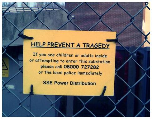
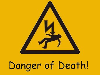
reasons, but then it was resurrected for the successful Microsoft Movie Maker program. From there, it was added as a typeface called Comic Sans (without a serif) in the Windows 95 operating system, and the rest is history. For the record, Vince also created the Trebuchet and Magpie fonts. Apparently, Comic Sans is the victim of its own success, its ubiquity (in the words of the art world). Too much of a good thing... familiarity breeds contempt. What should have stayed in the realm of the child-like and casual strayed into serious or formal territory. Comic Sans may have been wonderful for designs related to comic books, cartoons or children, but those in the know declared that it had no place in business or professional work usage. Thus, the Comic Sans backlash. The "Ban Comic Sans" movement is the brainchild of graphic designers Dave and Holly Crumbs, who admit their resistance is more than a little tongue-in-cheek. But love it or hate, we can all just get along and agree that there are certain times when Comic Sans is just inappropriate!
0 Comments
Leave a Reply. |
AuthorTo find out more about me, click on the Not Your Average Jo tab. Archives
February 2024
Categories
All
|


 RSS Feed